Using References in Art:

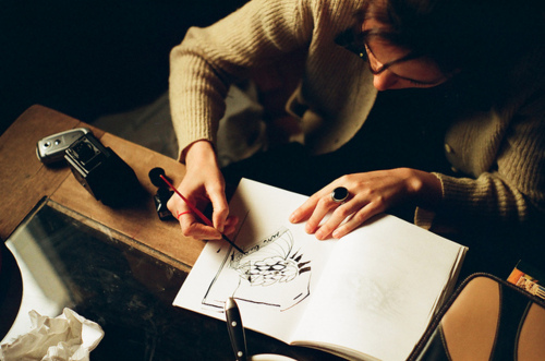
Have you ever tried to draw something but it just didn’t turn out exactly how you had imagined? That’s because you need to use some references! When you try to draw something without actually looking at it, it’s extremely difficult and it’s guaranteed that it won’t be perfect. I’m sure you’re probably wondering how all those artists you see in videos on YouTube make their art without looking at references, right? That’s because they most likely have a very strong visual library, meaning that they’ve drawn those things so many times that they don’t need to reference anymore! Even the smallest bit of referencing can go a long way, so don’t be afraid to look at other artist’s work or even pictures of things in real life.

Something else to remember about referencing is that instead of directly trying to copy your reference pictures, learn from them! Find many different pictures of different angles of what you’re trying to draw, whether it’s an object or a person in a specific pose. Although this process may seem a little slow, learn how the different parts of the object works because it will definitely help you in the long run! After you’ve broken down your references into pieces, draw what you’ve learned. Even though it’s probable that you’ll have to repeat this process for the first while, eventually you’ll build up your visual library enough that you won’t need to reference these things anymore because you understand how they work! Time for some examples:

garnet-no-referencegarnet-with-reference

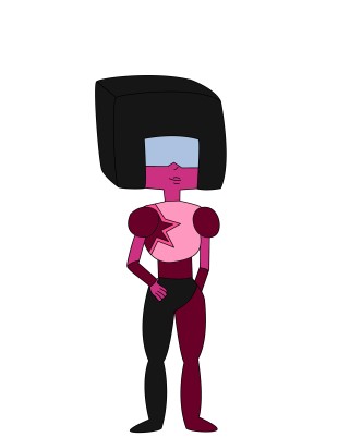
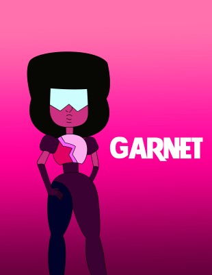
I decided to draw the character Garnet from Steven Universe. In the above pictures, the one on the left is using no references and I drew this off the top of my head with my current visual library. As you can see, the drawing doesn’t look too bad. However, it doesn’t exactly look right either. The proportions are off on some of the parts such as the arms and legs, and her hair is looking a bit odd. So, I looked up a few reference pictures of different angles, and learned about them. Then, using those references I tried to draw her again as you can see pictured on the right. She looks a lot more ‘lively’ now instead of flat, and the proportions are looking a lot better. This is just a small sample of what a difference using references make!

Sources:

http://shattered-earth.deviantart.com/art/The-BASICS-Using-References-255875213http://trisketched.deviantart.com/art/HOW-TO-MAKE-YOUR-ART-LOOK-NICE-Reference-n-Style-459492074


6 Common Art Blunders Artists Make:

All artists make mistakes, but the best thing to do is learn from them! There will always be a chance to learn how to correct them and make better drawings. There are a few common mistakes that every artist makes and I’m here to tell you how you can possibly fix them! Keep in mind that not every artist makes all of these mistakes, but reading this article will also help you prevent them from being made as well.

1.Bad Perspective:

Remember to draw things in perspective as it can really change the way a drawing looks. The closer something is to the viewer the bigger it is, and the farther away something is to the viewer the smaller it is. If you’re trying to draw a nice fall scene with a field of pumpkins in the back, you won’t want the pumpkins to look like they’re 10 feet tall and take up half the page! Unless they’re some species of giant pumpkin, that would be terrifying. Just remember to make things only as big as they need to be.  

2.Outlines:

Outlines are really only an issue if you’re attempting to draw things and make them look realistic. The real world doesn’t have outlines, so they can accidentally turn your once realistic drawings into flat, cartoonish images. Outlines are useful when you’re in the sketching stage, but they should be less prominent in a finished drawing.

3.Inconsistent Lighting:

Lighting is extremely important in a drawing! Don’t forget to show where the light source is coming from in your drawings and shade them appropriately. When you shade in a light source, once side of your object will be lighter or darker than the other side.

4.Heavy Gradients:

Using gradients are a great tool to add depth and life to your drawings, but don’t add too much! There’s a time and place for them, and not every object you draw needs it. Study and reference pictures of what you’re drawing, don’t assume otherwise you will possibly make mistakes! Keep in mind that flat sided objects such as cubes don’t need gradients whereas things like spheres and cones do.

5.Sloppy Shading:

Don’t ever rush shading! Remember that artwork takes time, and there’s no way to speed it up if you want your finished piece to look as stunning as you had imagined. Resist rushing the shading process and scribbling, especially at the end. Take your time and make sure to shade carefully throughout your entire piece. Devote your time to what you’re drawing instead of trying to hurry. Limit distractions as well for it will prevent you from accidentally rushing your drawing along.

6.Inscribing Lines:

This is a mistake that I have made a countless number of times, especially when I was first learning how to draw. When you press hard on the pencil as you draw, it makes dents in the paper which are called depressions. You can easily erase the pencil marks, but the depression will stay in the paper. Therefore, when you go to color or shade it in, you get these unattractive white lines in your paper that stick out like a sore thumb and cannot be covered up. You can use these to your advantage if you’re trying to do some neat looking abstract art, but most of the time you will not want these lines in your drawing. My suggestion to eliminate these is to either try pressing lightly as you draw, or you can always transfer over the drawing onto a different, clean sheet of paper for the coloring/shading process.


Next week I’ll be writing an article on how to use references when drawing which can be very handy. Updates will be coming!


Information from: http://helloartsy.com/10-drawing-mistakes/

5 Art Programs Every Digital Artist Should Use:

One of the biggest questions aspiring digital artists have is what type of software they should use. While the decision of which programs are best for you depends on what type of art you like to do digitally and what your style is, there are definitely a few suggestions I can make! Here are the top five art programs I suggest, along with the pros and cons of each:

  1.        openCanvas

openCanvas is a program that is perfect for sketching and for those who are familiar with the layout of Photoshop. You have the ability to customize brushes, ruler tools are available for use, the interface of the program is user-friendly, and you also have the ability to create ‘event’ files which allow others to watch you draw. The downside to this program is that there aren’t as many drawing/painting tools available in openCanvas as there are in other programs.

  1.       Paint Tool SAI

Paint Tool SAI is a great program to use for drawing and coloring digitally. It’s a very lightweight and smooth program to use, and the program itself is very responsive. Paint Tool SAI allows its users to easily draw delicate things, and when it’s running there is little to no lag on the computer. Another very good thing about this program is the fact that it isn’t as ‘resource hungry’ as photoshop is. One of the only cons that I’ve seen for Paint Tool SAI is that there aren’t as many filters available as there are in other programs.

  1.       Sketchbook Express/Pro

Sketchbook Express/Pro is a program that’s very simple to work with for sketching. It features a simple interface, it’s tablet-PC friendly, and the tools available are able to imitate pens, pencils, and brushes rather well. A difference between Sketchbook Express and Sketchbook Pro is that Express has limited tools and functions, whereas Pro has everything. Another big downside is the fact that this program is designed only for quick sketching, so there are a limited amount of layers to use.  

  1.       GIMP

GIMP is a free program that works on Windows, Mac, and Linux computers. It has a wide assortment of tools and brushes to use, and it’s a simple program to learn. You can also customize the brushes which comes in handy. However, a drawback to this program is that it has been reported to be slow (depending on your computer) and a bit glitchy at times.

  1.       Photoshop

Photoshop is a program perfect for anything from drawing all the way to photo editing. There are plenty of design tools to choose from and this program is also useful for photo corrections and manipulation. The interface is user-friendly, and users can start editing photos and creating right away with ease. A downside to this program is the fact that the interface can be very overwhelming to people who are just beginning with these types of things. A final drawback is that not all the updates are completely bug free as soon as they’re released. There will usually be a couple bugs and glitches that need to be fixed and reported.


Information used from:

http://kikirini.deviantart.com/journal/Free-and-cheap-Art-Programs-234405992

http://brandongaille.com/8-pros-and-cons-of-adobe-photoshop/

http://www.conceptart.org/forums/showthread.php/222033-Photosop-vs-Paint-tool-Sai


4 Quick Tips About Drawing

Drawing is a form of art that absolutely anyone is capable of doing. Nobody is born being able to draw, and everyone can learn how to do it! With that said, some people have developed their skills more than others have, but there are always new tips and tricks to learn. Here are some of the tips that I’ve found to be most useful, and I hope you’ll think the same.

  1. Avoid Smudging Your Drawings:

When drawing in pencil (or any other smudge-able type of medium), use a piece of paper underneath your hand to avoid smudging your work. It’s suggested that if you’re right-handed, start shading from left to right, and if you’re left-handed, start shading from right to left. While smudging lines in a drawing can be useful – especially when it comes to shading – it becomes difficult to make a sharp, clean drawing when your hand constantly smudges the lines.

  1. Control:

Being in control of your drawing utensils and knowing how to make them perform how you want is a big part of creating art. Changing the value (lightness/darkness) of your lines can help in adding contrast and details in your drawings as well. To help gain better control of the pencil, it all depends on your hand placement. Positioning your hand closer to the lead end of the pencil allows you more precision for fine details, but this also results in heavier, darker strokes. Positioning your hand closer to the eraser end gives you less control, but it will allow you to have lighter strokes which are a key component for shading.

  1. Use References:

While drawing, make sure to use and study photos of objects or even the objects themselves in real life. At least half of drawing involves observation. To be able to draw something well, you need to see it. For example, have you ever decided to whip up Filet Mignon one night without even looking up a recipe? Of course not! If you have then I’m curious as to how that went for you. However my point is you need to learn how to do something before you actually do it, and this is very true in drawing.  Therefore, if you want to draw something: study it first, find some pictures, and then go for it!

  1. Practice:

This is the most cliché tip of them all, but it’s the best one there is. If you want to become a better artist, the best thing you can do is practice. Practice every day, and draw whatever you see. If you are unable to draw, then look at objects and imagine how you would draw them. Think about where the light source is coming from, what medium you would use, and what basic shapes you would use in your drawing. There is always so much more to learn, so get inspired and have some fun!

artist-drawing

Information, ideas, and picture taken from:

http://thevirtualinstructor.com/QuicktipsDrawing.html

http://www.creativebloq.com/illustration/sketching-tips-beginners-81516497

I Think I Can’t Draw